
Bringing Voice and Community to Medication Tracking
With a focus on accessibility, I conducted user research, synthesized findings into empathy maps, POVs, HMWs, and built the end-to-end mobile experience, from wireframe sketches to a functional prototype in React Native and Next.js.
try out on expo go →
check out my final report →
MY ROLE
Product Designer
Mobile/Web Developer
TEAM MEMBERS
1 Software Engineer
TOOLS USED
Figma
React Native
Next.js
TIMELINE
10 weeks
PROBLEM STATEMENT
"Half of Americans on prescription medication don’t take them correctly and/or face daily anxiety not knowing if they’ve already taken their medication (World Health Organization, 2003)."
While medication adherence has been widely studied and supported, many existing tools still fall short as these tools can easily break down during moments of fatigue, stress, or accessibility limitations.
SOLUTION OPPORTUNITY
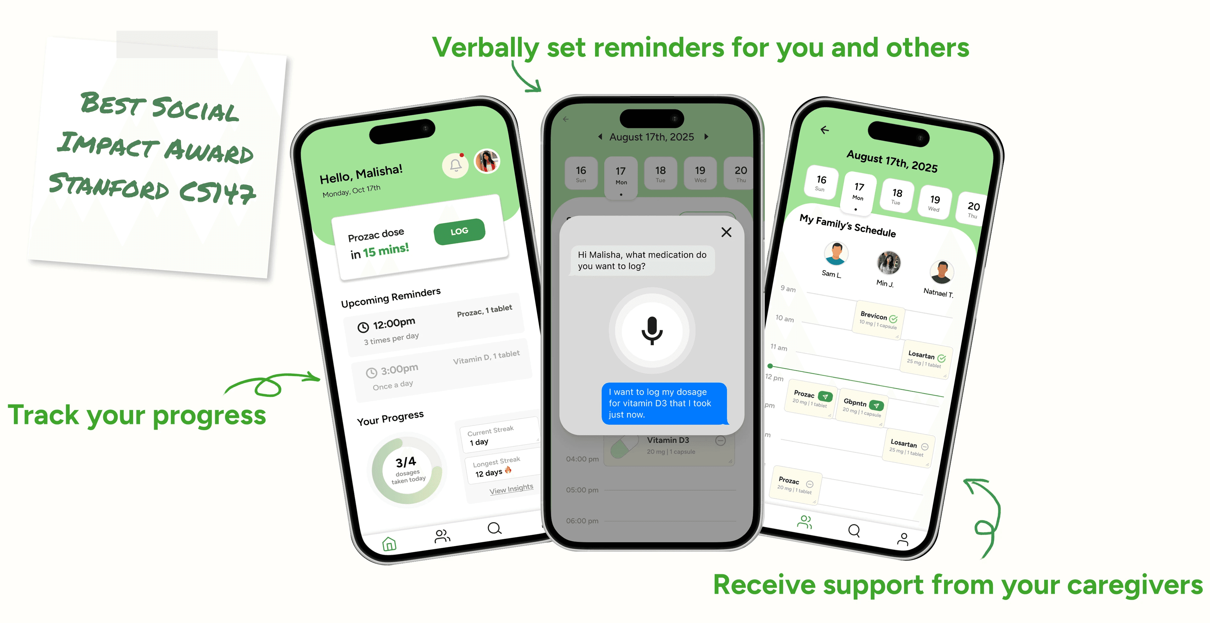
Develop a voice-enabled medication tracking companion that allows sharing text or voice reminders with your friends, family, caregivers for proactive social support and medication accountability.
I was able to create fully functional, launch-ready mobile app Pill Pal, which was awarded Best Social Impact and Best Poster out of 20+ teams at Fall 25 CS147 Project Expo.
WHITE PAPER RESEARCH
A way to achieve goals with
95% success
I'm really passionate about behavioral change in general, so before touching the visual elements of the design I started off with white paper research.
I stumbled upon a really interesting statistic from the American society of Training and Development [ASTD], 2010:
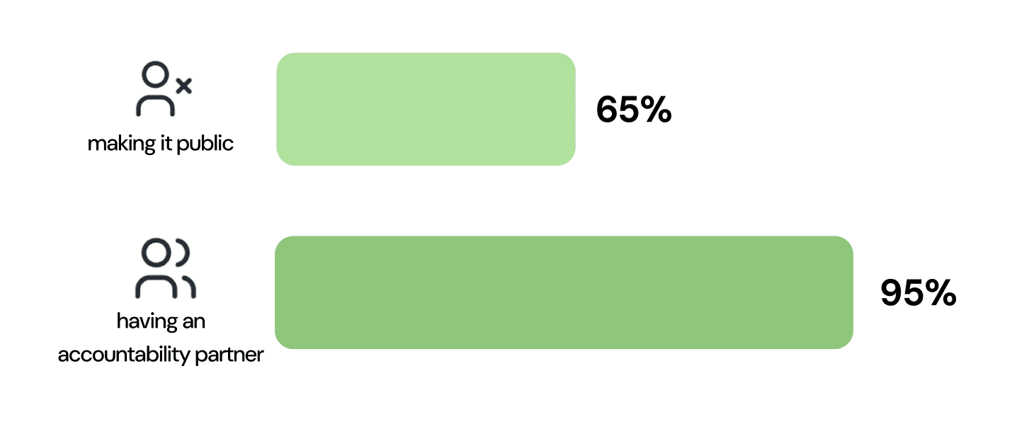
People are 65% likely to meet a goal after making that goal public, but their chances of success increased to 95% when they had a specific accountability partner to report to.
Personally I have never heard about this before, and while I thought it was super interesting, I wanted to keep this at the back of my mind while I did other research and expand my horizon.
COMPETITIVE ANALYSIS
The competition had little to NO shared accountability aspect
Since this space of medication adherence and tracking are saturated, I wanted to explore what was currently successful and could be improved.
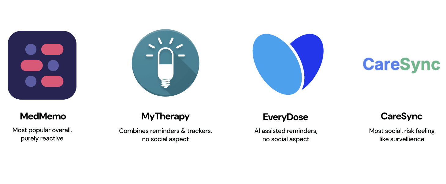
Across many user reviews, a common theme emerged: people often stop using these apps because they don’t feel enough accountability or motivation to stay consistent with their medication routines.
NEEDFINDING + USER INTERVIEW
Talking to patients
I conducted user research interviews with people managing medications to identify when routines break down and what creates real-time confusion or uncertainty.

medications ranging from time-critical prescription drugs to non-critical vitamins and supplements
Here's what I learned:
Patients forming the habit struggle to maintain consistency due to disrupted or unpredictable moments in daily life (unexpected meetings, travel, changes in schedule).
When it comes to patients with established routines, the challenge shifts from remembering to take medication to remembering whether they already took it, leading to anxiety about double-dosing or missed doses.
Physical exhaustion makes medication management feel like a personal burden, particularly for non-time-critical medications with no immediate consequences for delays.


Empathy map + KEY INSIGHTS AND NEEDS FOR EVERY PARTICIPANT
FRAMING THE PROBLEM
Defining primary users
To look deeper into the insights, I defined three primary user and created POV statements to frame their key needs.
And this revealed that the core issue wasn’t just remembering medications, but the uncertainty of whether doses were taken and the sense of isolation of managing them alone.

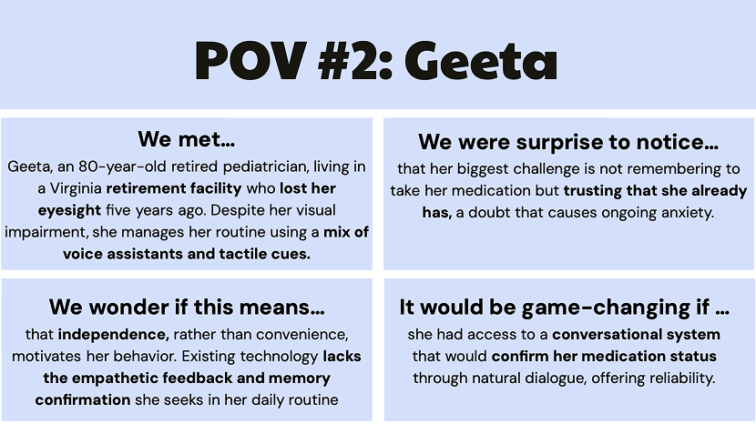

THREE PRIMARY USERS DEFINED IN POV STATEMENTS
Crafting HMW questions
I then brainstormed 10+ “How Might We” questions per user to explore potential solutions.
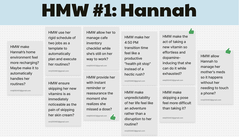


I narrowed 10+ HMW questions into three design priorities that addressed the most critical user needs and guided the rest of the design process.

TESTING DESIGN CONCEPTS
Brainstorming solutions
I brainstormed 10+ solutions per HMW and selected the top three to develop into experience prototypes:
- a game-like interface to boost motivation
- voice-based conversational interactions for humanlike support
- caregiver-recorded voice clips and texts for extended connection
Through user testing of each prototype, I decided on core features:
An eye-catching streak display to reinforce progress and build momentum.
Address the "did I take this already" problem with log/history feature for completed doses
Quick voice interactions within their care network without requiring visual attention or disrupting workflow.


brainstormed solutions for each three HMWs
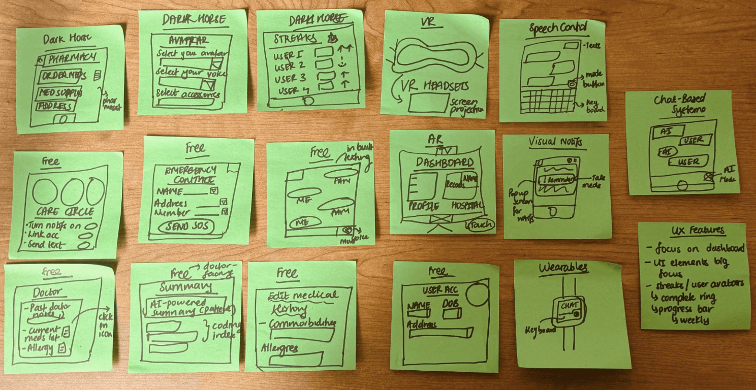
thinking outside the box for solution ideas
WIREFRAMING + USER TESTING
Iterating prototypes
I sketched out the three core user flows:
- logging medication
- sending text/voice reminders to someone in Care Circle
- joining a Community Circle
I also explored supporting screens like the notification center and calendar view. From there, I built out medium-fidelity prototypes in Figma to test the interactions.
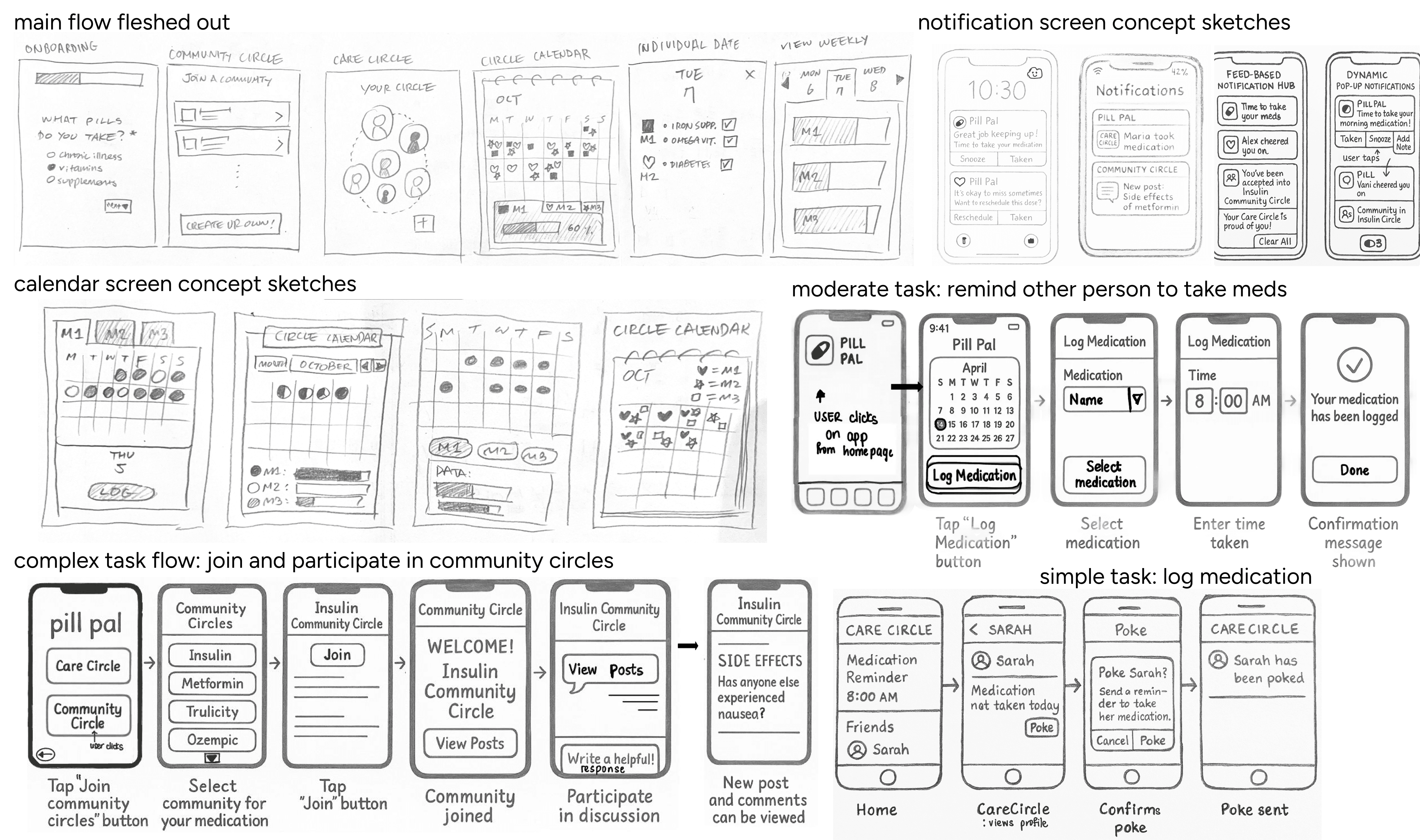
low fidelity wireframing sketches
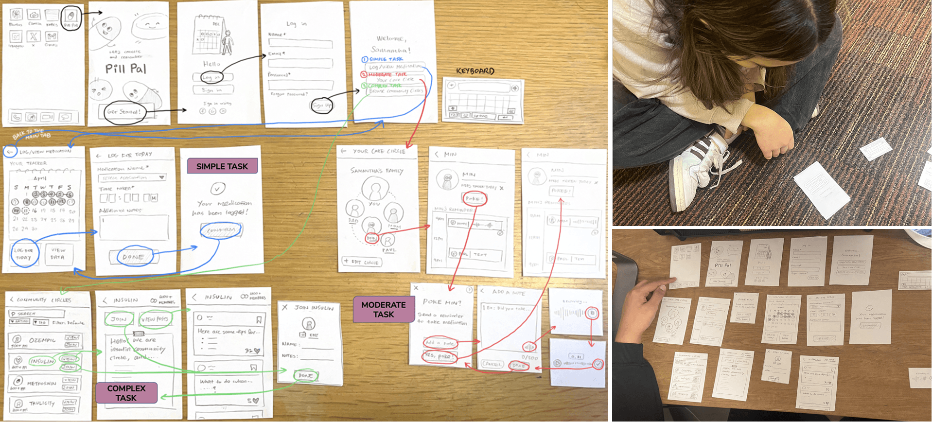
paper prototype and lightweight usability testing
MAIN CHANGES + MED-FI
Main feedbacks
Users wanted...
Clearer primary action on home screen
Confirmation feedback screens
Distinct visual cues for completed vs. upcoming dosage

Keeping this in mind, I translated the three tasks into interactive flows while improving based on the previous user testings.
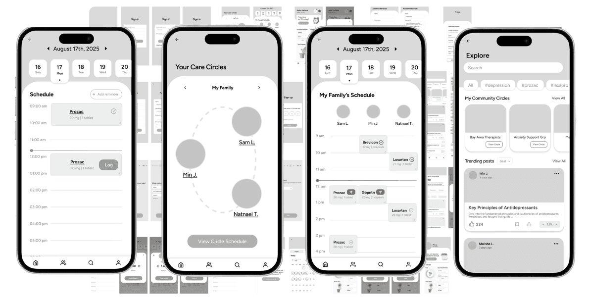
medium fidelity in Figma
DESIGN SYSTEM & STYLE GUIDE
Defining visual direction
I was gravitating towards incorporating swirling line elements to represent connection and community, which I wanted to reference the shared accountability aspect of the product.
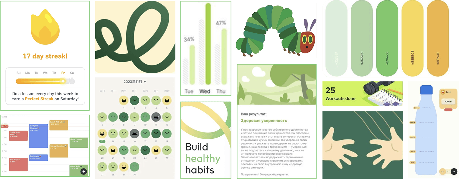
building the moodboard
Building complete visual system
I overall considered the color psychology and I found that green symbolizes the color of growth and health. Hence that became my primary color.
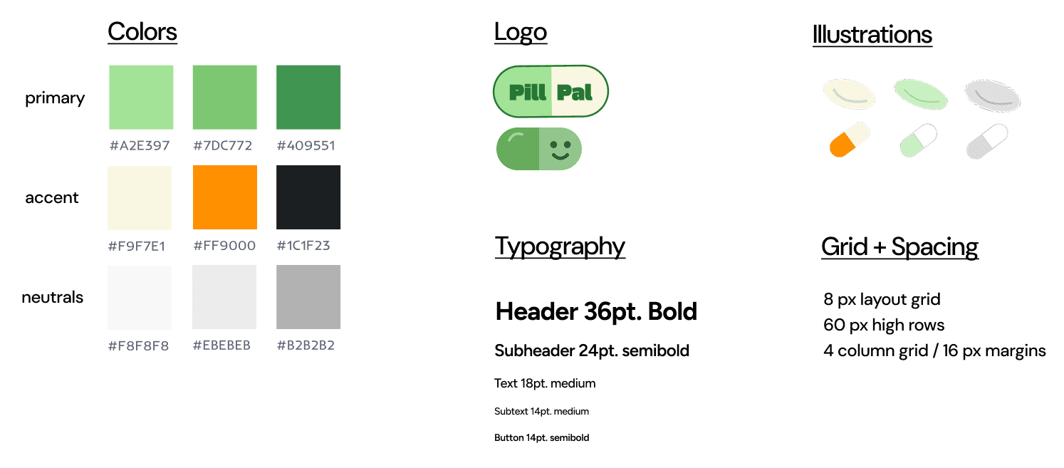
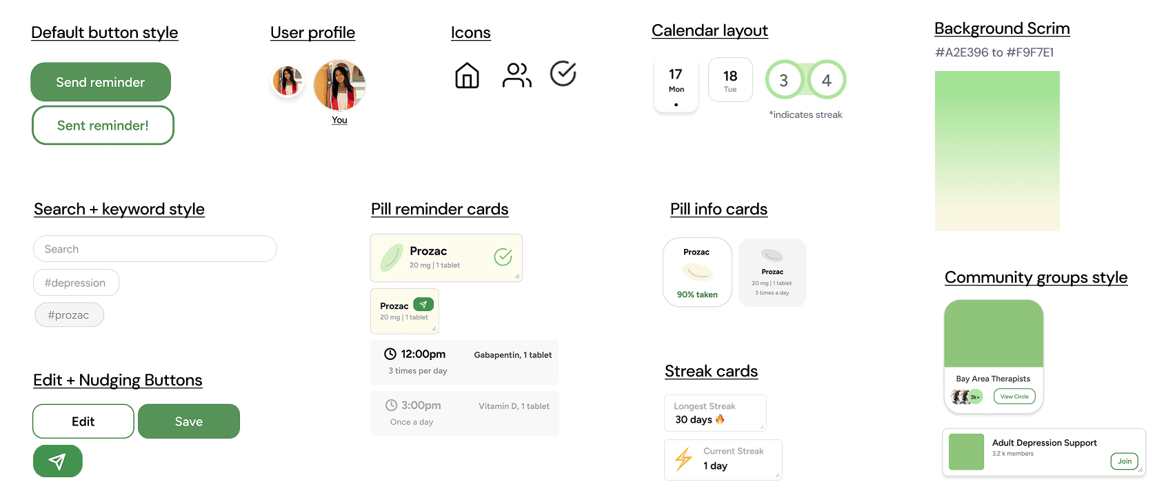
Component system for consistency and efficiency
For the actual app interface, I looked at my competitors to see how they formatted their UI.
Taking all these into perspective I created a bunch of different sketches and this component system to stay consistent within my own app design.
HI-FI MOCKUP
Interactive prototype
I developed 42 screens covering core interaction flows (lecture selection, section toggling, multi-course comparison) and interaction states (hover, active, disabled, loading).

Check out my figma prototype →
USABILITY TESTING
Usability testing
I defined usability goals before conducting testing with 12 participants:
- can users log medications without errors?
- does voice interaction feel natural for reminders?
- can they intuitively navigate community features?
- does the design foster encouragement after task completion?
I included ethical considerations specific to health technology to Nielsen's Heuristics to improve accessibility in addition to evaluating visual and functional inconsistencies.
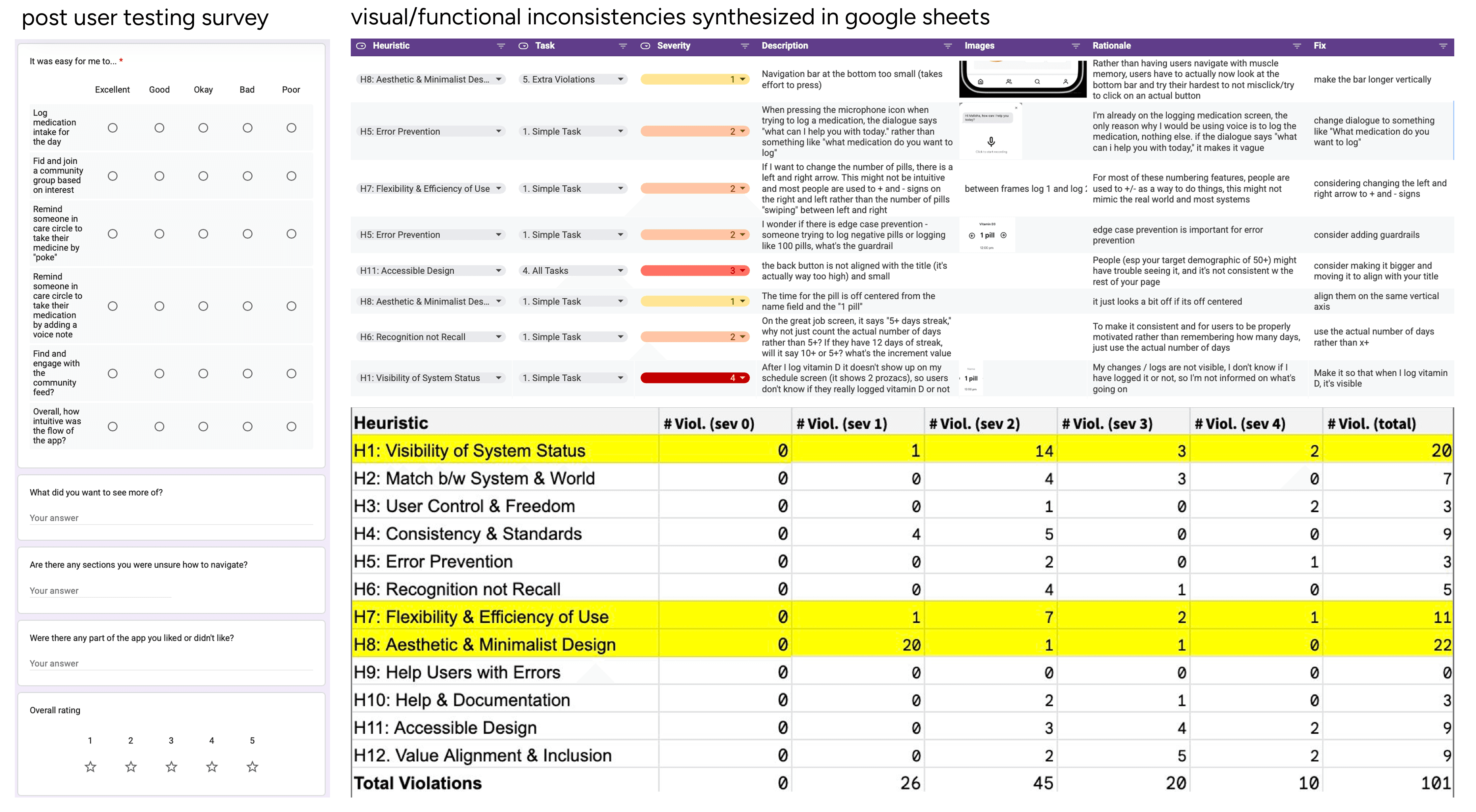
heuristic evaluation of 40+ design features using spreadsheet-based analysis
Main design + functional improvements
Based on user testing, I made these design changes below:

improved the visibility of system status

ensured the interface met WCAG color contrast + touch target sizing standards

sharing preferences for who might feel uncertain sharing medication data

refining home screen visual hierarchy
DEVELOPMENT & LAUNCH
wizard of oz prototyping
I implemented Wizard of Oz approach for the streak tracker to test whether visual progress motivates users. The progress element appear live but it doesn't actually store or track data.
front-end implementation
A software engineer teammate and I collaborated using React Native and Next.js. Link to github repository embedded within text
— Application Framework : React Native
— Navigation : Expo Router
View github repo →
marketing deliverables
In addition to the working prototype in Expo Go, we built a promotional website using HTML/CSS, created pitch slide deck and script, and produced a concept video.
Check out pill pal's website →

FINAL DESIGN SOLUTION
Onboarding experience
One major concern from user testing was privacy. Participants noted that users with stigmatized health conditions—such as depression or mental health medications—might feel uncomfortable sharing their medication status even with trusted caregivers in their Care Circle.
This is very important issue to address in the Pill Pal app. It ties back to its brand identity of inclusivity and accessibility.
I addressed this by adding sharing preferences during onboarding and allow users to control exactly what medication data is visible. This improves both privacy and accessibility for those hesitant to share sensitive health information.
Log dosage manually or
via voice
Users have two logging options: a voice-assisted feature for hands-free entry, or manual input where they can type the date, dosage, and medication name.
I implemented voice assistance specifically to reduce cognitive load when users are physically or mentally fatigued. They can quickly log their medication without breaking their routine or requiring more attention.
Once logged, users can access detailed adherence analytics and track their streak over time to monitor consistency.
Extended social support system
Users can invite friends, family, or caregivers to form a personal Care Circle. Once invited—and based on each user's sharing preferences—they can view each other's dosage schedules and send reminders via text or voice.
Beyond personal networks, users can join Community Circles—similar to Reddit groups—where they can connect with others managing the same condition and engage with supportive content.
I designed these features to reinforce that medication adherence should not be an isolated experience and make users to feel community support by building a reliable support system around adherence.
CONSTRAINTS AND LIMITATIONS
Backend implementation
Due to time and resource constraints, we focused on front-end development and used Wizard of Oz techniques to simulate data-driven features like streak tracking.
Tight schedule to ship fast
My teammate and I had 10 weeks to research, design, and build a functional prototype, which required prioritizing main features and rapid iteration.
LEARNINGS AND FUTURE THINKING
Consider complex medication schedules
The next step is to accommodate varying medication scenarios including critical vs. non-critical timing, temporary prescriptions, and shared caregiving contexts.
Conduct long-term user testing
I'd conduct extended usability studies specifically testing how reminder frequency, tone, and modality (visual vs. audio) affect sustained engagement.
Integrate AI to accelerate process
Incorporating AI development tools like Cursor or Lovable would accelerate the design-to-code workflow and iterate faster on accessibility features.
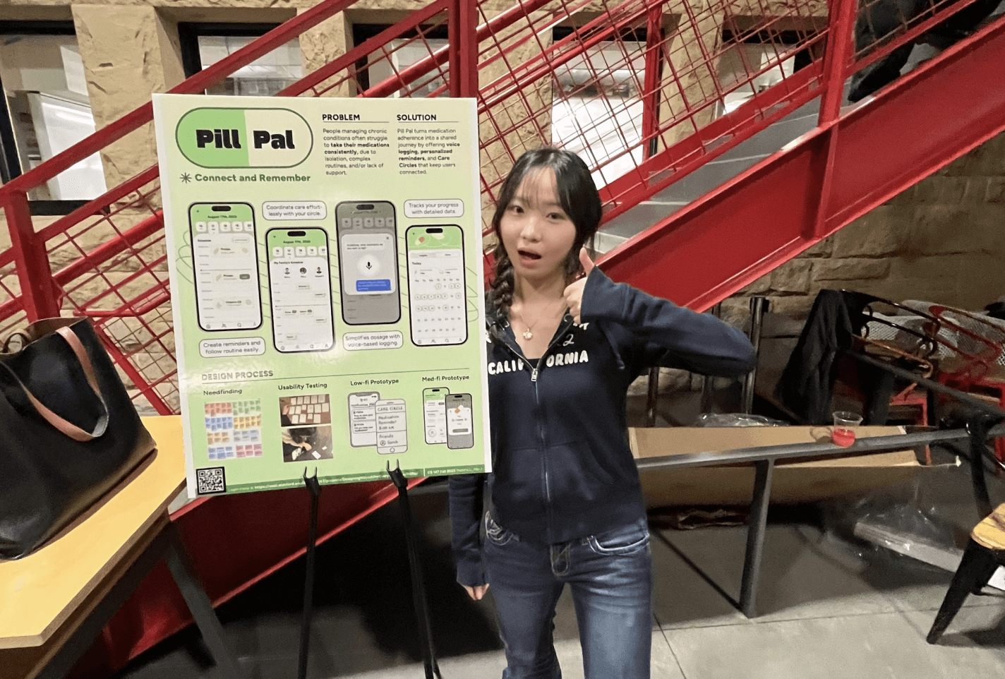
Picture from Stanford CS147 Project ExpO

POSTER DESIGNED BY ME THAT WON THE BEST POSTER AWARD!