
Simplifying course planning and comparing lecture options
I led the end-to-end design of a multi-lecture course selection feature for Stanford's campus-wide course planning platform. Through iterative research with 15+ students, I translated user needs into intuitive interaction flows, taking the feature from low-fidelity concepts to production-ready, high-fidelity designs in collaboration with engineering.
try out on CARTA →
check out my FIGMA FILE →

MY ROLE
Product Design Intern
TEAM MEMBERS
2 Product Designers
TOOLS USED
Figma
Figjam
Google Doc
TIMELINE
10 weeks
CONTEXT
Carta is Stanford's course planning platform, regularly used by 95% of the student body. Their approach is "Course planning, simplified through student insights."
PROBLEM STATEMENT
Many high-enrollment introductory courses at Stanford, such as Math 51, offer multiple lecture times under a single class listing.
In Carta, the current flow for selecting and adding a specific lecture time to the user's schedule is not supported at all, which can create confusion and ambiguity.
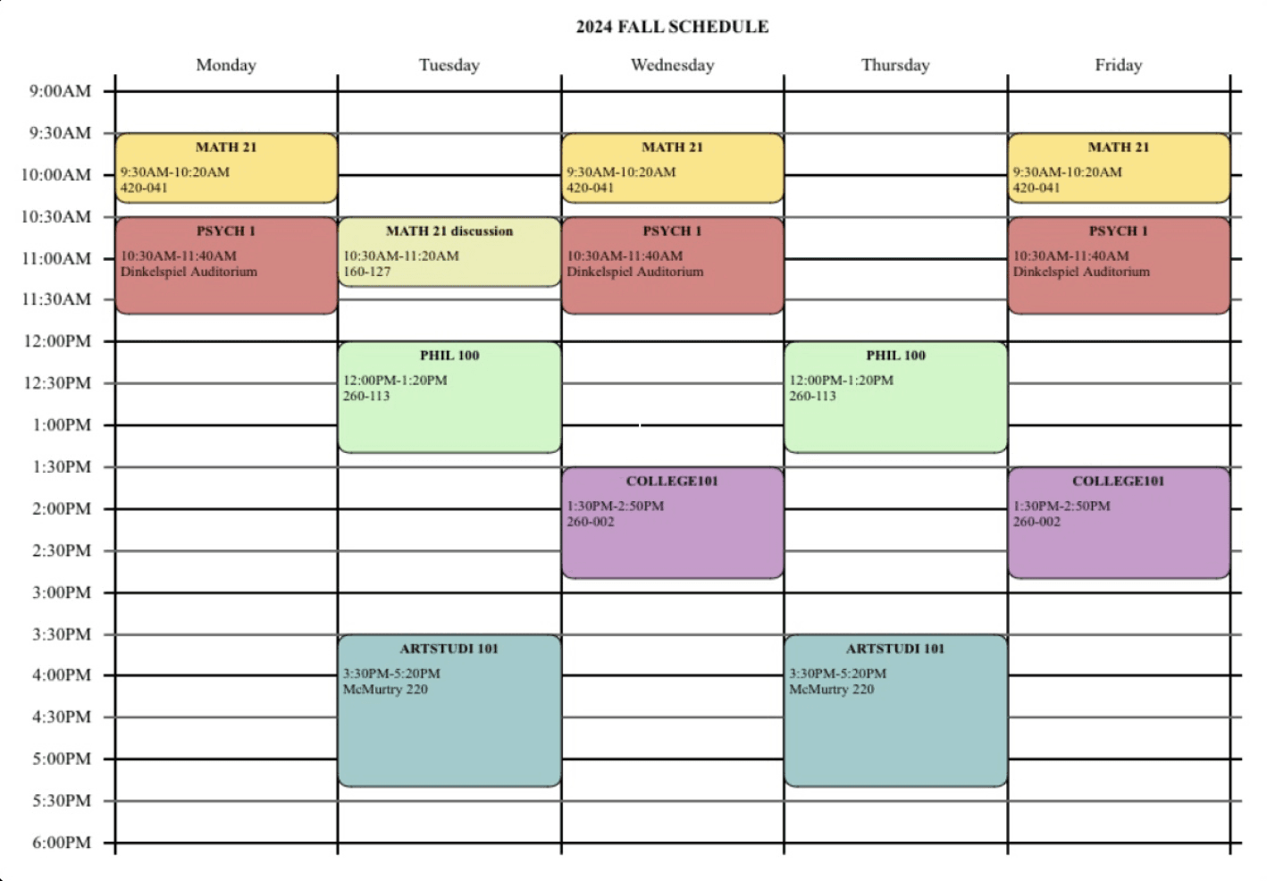
An example of how Carta's lack of multi-lecture support forces students to rely on external scheduling tools and manual workarounds.
SOLUTION OPPORTUNITY
I designed and shipped a multi-lecture course selection feature that makes quarter planning faster, clearer, and more flexible.
The experience balances visibility of multiple lecture options with a clean interface, allowing students to make informed scheduling decisions without sacrificing context.

check out my FIGMA FILE →
USER RESEARCH
Talking to students
I wanted to talk to other students to understand the tools and processes used in schedule planning outside of Carta.
I interviewed 5 students from a variety of background from computer science, design, and human biology and document how they manage it, where they get confused/frustrated within their process, and what can be improved.
Here's what I learned:

Reframed design challenges
Based on these user insights these were the questions I came up with to guide myself throughout the project.
How might we let students know that a class has multiple lectures?
How might we depict a specific lecture in the sidebar calendar?
How might we make a design to give students the freedom to experiment with different times?
COMPETITIVE ANALYSIS
Exploring existing Stanford resources outside of Carta
To understand existing design patterns, I looked at popular Stanford-specific tools like OnCourse and Enrollment Navigator.

BOTH relied heavily on pop-ups or switching between views to check lecture times.
From my user testing, these patterns often caused students to lose context. So one big takeaway was: students need to see the full schedule while making decisions.
Analyzing Carta's design system
Because this feature lives inside Carta, I really wanted my solution design to feel like a natural extension from here. Carta uses:
Stanford's cardinal red as its primary color
card-based layouts
structured whitespace
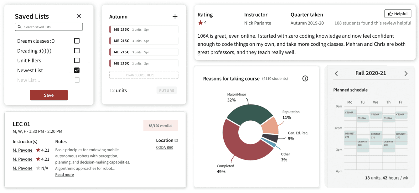
CLEAN, SIMPLE, NEUTRAL TONE
DEFINING INTERACTION FLOW
Brainstorming and wireframing
I first mapped the feature at the interaction level, determining where actions belonged in the user journey and how transitions should behave.
Based on my research and my own ideation, I prototyped five distinct interaction patterns on paper. after two rounds of lightweight testing with five students, I narrowed the concepts down to the two most intuitive approaches.
Five interaction patterns tested:
Toggle within calendar view
Center modal popup
Dropdown from "Plan" button
Dedicated schedule tab
Search bar dropdown menu
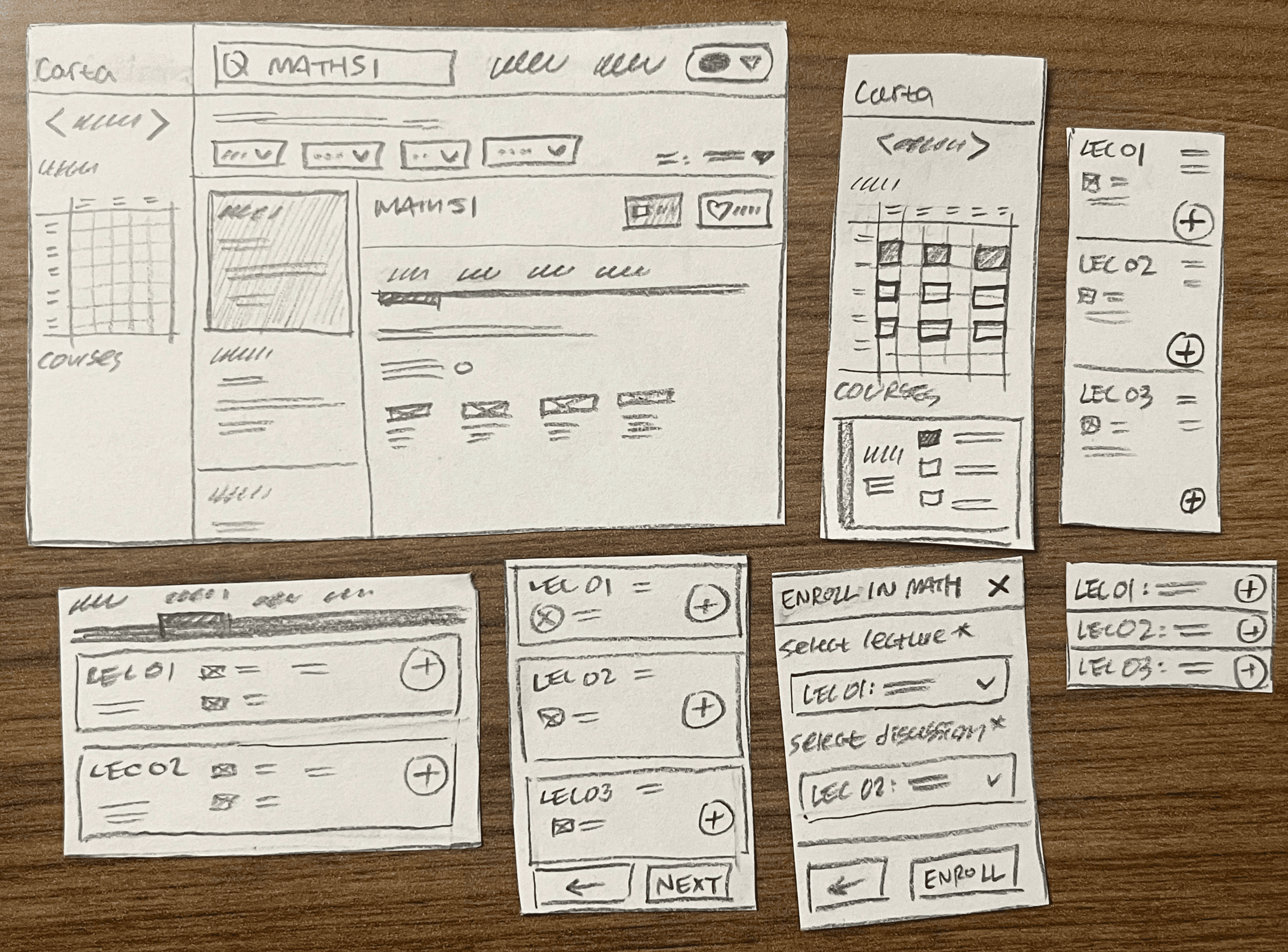
Conducted lightweight A/B testing
After initial paper testing, I narrowed down to two interaction patterns based on feedback from the design team.
I recruited seven new student participants and focused on qualitative signals.
Flow 1, which had a dedicated schedule tab, and flow 2, which had toggle embedded within the sidebar calendar.
Flow 1
Flow 2
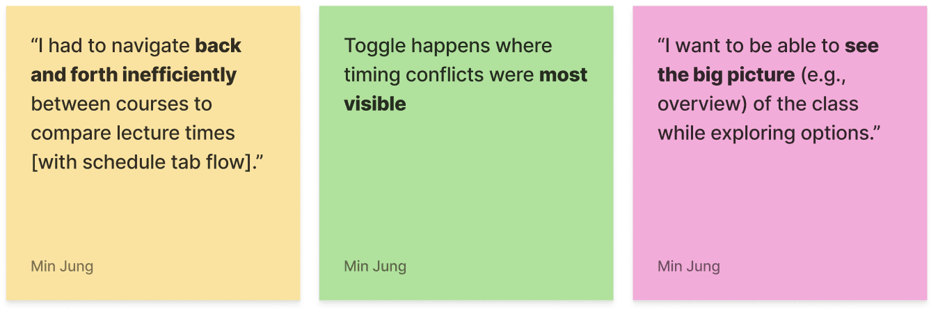
Key insights + analysis
Overall, majority of the users preferred calendar toggle because it allowed comparison without losing context.
UI Pattern Exploration
Researching beyond Stanford
I researched course planning tools at peer institutions.
Across many of them, I noticed a consistent pattern: expandable dropdowns with immediate visual confirmation in a calendar view.
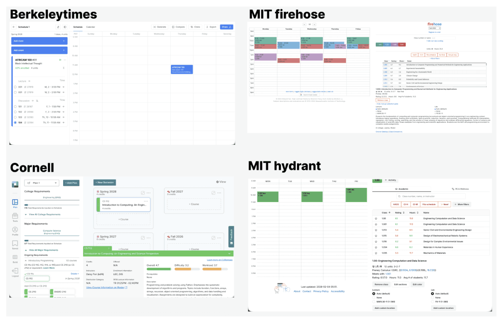
SCREENSHOTS OF THE FOUR INSTITUTIONS' COURSE PLANNING WEBSITES
Exploring different interface designs
Some were inspired by peer institution while others built on Carta’s existing collapsible UI patterns. Carta uses collapsible, expandable components, so I prioritized and narrowed down to three concepts (cycled in blue) to prototype digitally.
I narrowed them down to three concepts to prototype digitally.
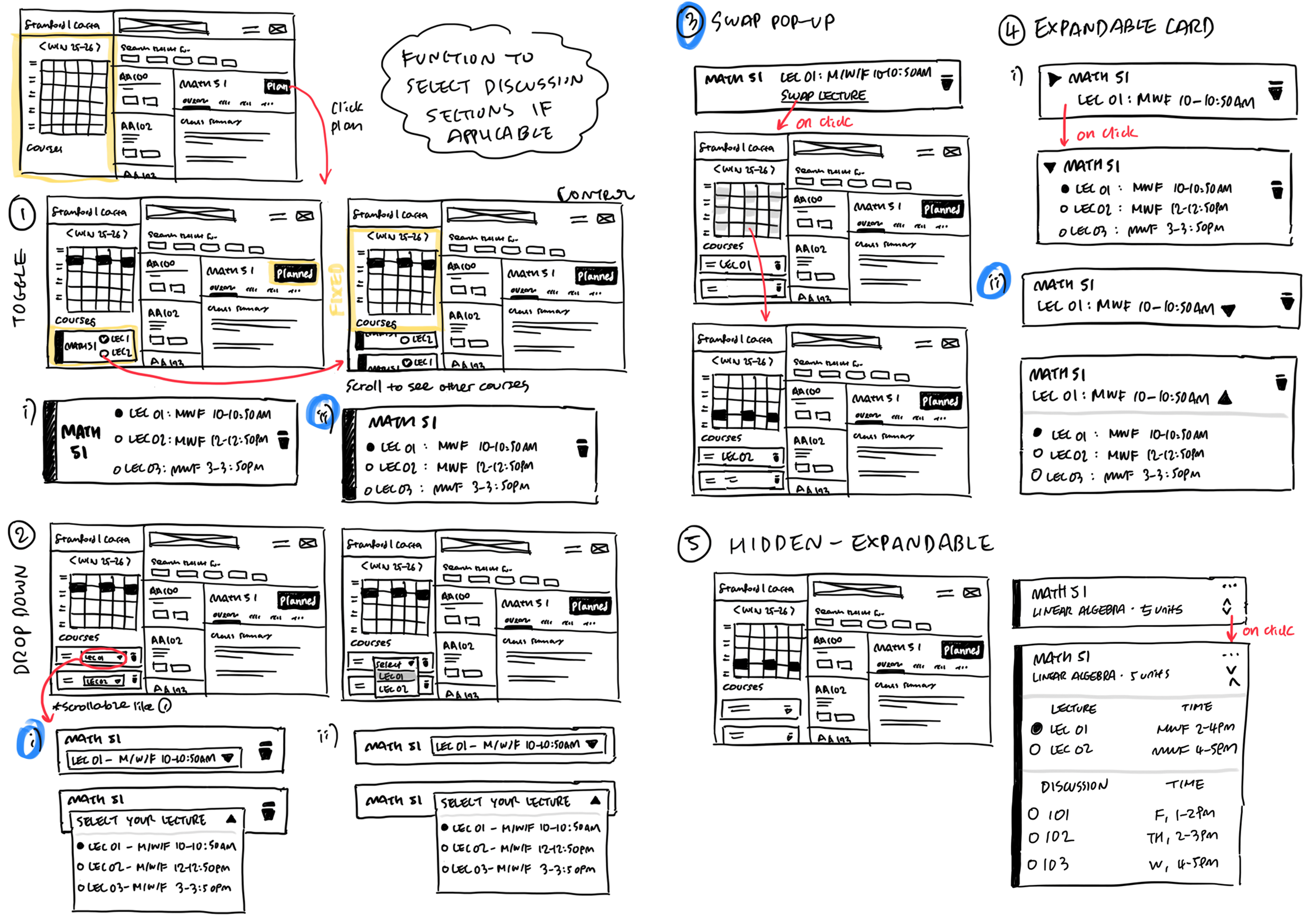
FOCUSING ON MAINTAINING CARTA'S visual & functional consistency
Defining usability goals and testing
My primary question was deciding which one best supports the most quick and confident swap between lectures to determine schedule fit?
Then I set three secondary testing goals:
Which design minimizes cognitive load and confusion?
Which supports comparison across options most naturally?
Which feels least intrusive in the context of planning a full schedule?
swap pop-up
drop down
simple toggle
Dropdown felt the most clean
and scalable
Participants strongly preferred seeing all lecture times immediately while planning without extra clicks.
So the key takeaway was to use dropdown pattern for this feature and keep the interaction within visual cues.

DESIGN ITERATION
Dropdown creates inevitable
visual clutter
However, I realized the dropdown toggle introduced significant visual clutter in the sidebar. It felt crowded and difficult to scan.

three additional iterations


other unsuccessful iterations
FINAL DESIGN + ENGINEERING HANDOFF
Backtracking to full-screen flow
I stepped back and rethought the problem, keeping user feedback in mind.
My goal was to find a solution that balanced both needs: maintain context while planning.
Placing dropdown within overview tab
I landed on the final design of placing dropdown in th overview tab. This way, students keep context while experimenting with different lecture and discussion times.
I used previously unused white space in the overview tab instead of the sidebar, which solve the problem of having to cram all the texts into a small side bar.
It also handles edge cases efficiently: if a class has no discussions the dropdown disappears, and if there’s only one lecture option it simply defaults to that time.
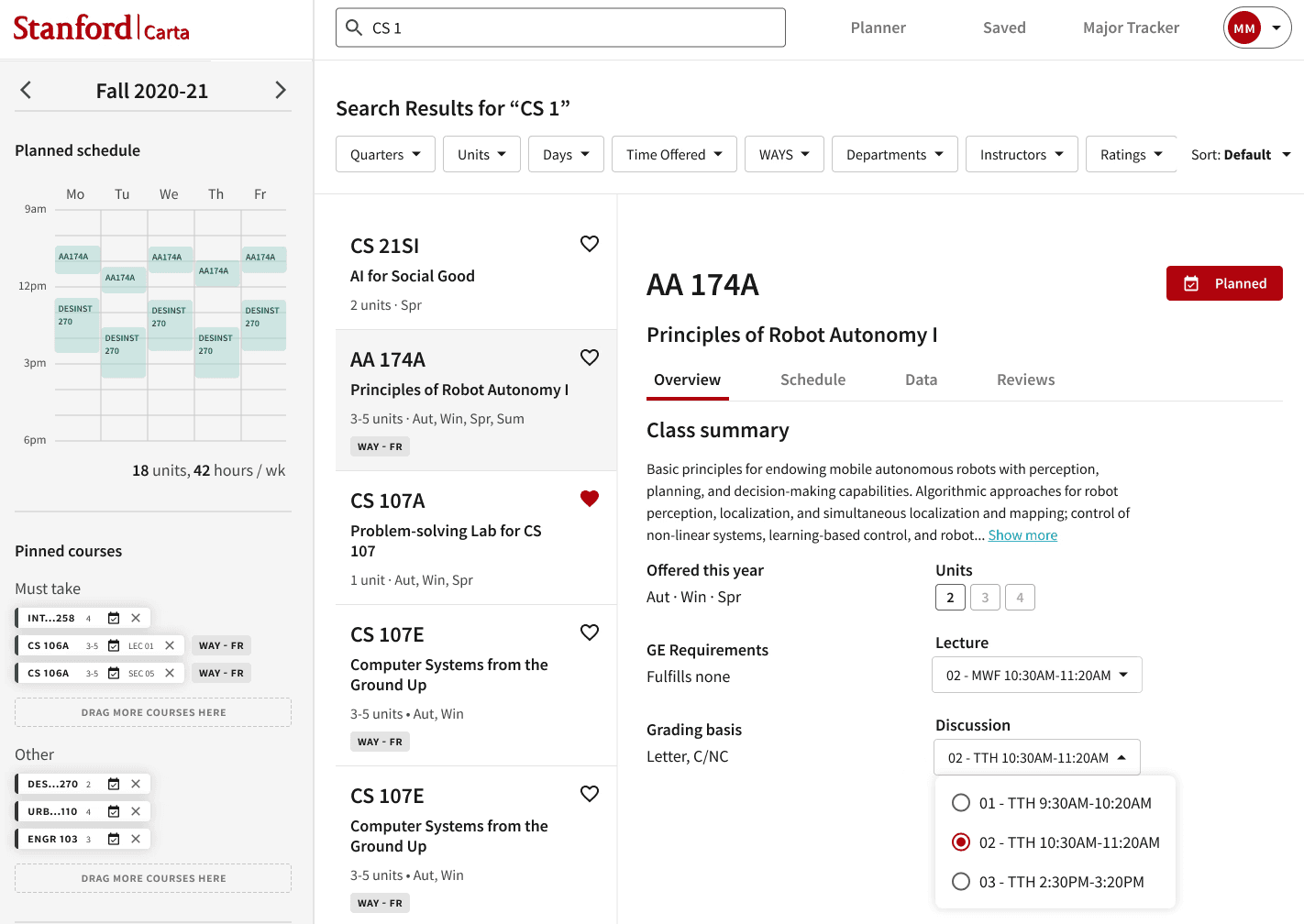
Documented key design decisions and flows for developers
Once the design was finalized, I wrote clear design rationales to support implementation for anyone to easily pick up.
My background in front-end engineering helped keeping the communication smooth.
IF I HAD MORE TIME + TAKEAWAYS
Conduct longer-term usability testing
I want to run longer-term usability testing during an actual enrollment period with this overview tab. With that I can explore additional edge cases in real course planning workflows.
Implement AI-assisted schedule recommendations
I interviewed a student who uses LLMs to help plan their quarter schedule.
It'd be interesting to explore lightweight AI assistance, such as suggesting lecture times that fit best within a student’s schedule or highlighting potential conflicts.
Design around the decision-making contexts
One key lesson was becoming comfortable moving back and forth within my design.
When my initial toggle approach didn’t work, I had to step back, revisit the problem, and return to user testing to find a better direction.
Conduct lightweight usability testings throughout my process
It's something now I try to do intentionally given how valuable it is to ground my design in real user behavior.