
Bringing Course Planning and Schedule Management to Mobile
I led the mobile adaptation of Carta's course planning experience, translating a desktop-first interface into a native mobile flow. From lightweight competitive research, low-fi and med-fi wireframes to a finalized engineering-ready design.
check out my FIGMA FILE →

MY ROLE
Product Design Intern
TEAM MEMBERS
2 Product Designers
TOOLS USED
Figma
Figjam
Google Doc
TIMELINE
10 weeks
CONTEXT
Carta is Stanford's course planning platform, regularly used by 95% of the student body. Their approach is "Course planning, simplified through student insights."
PROBLEM STATEMENT
Carta is really built for desktop — its mobile experience feels very chunky and hard to navigate, even though many students might want to access Carta on their phones.
So the main question was to figure out how to fix this broken experience and make it smoother and transferring the original desktop experience to mobile without changing too much so that the users who are used to navigating via web can intuitively mobile.

ACCESSING CARta on mobile feels broken
SOLUTION OPPORTUNITY
I designed a mobile navigation system that keeps everything Carta users already rely on, such as the search, the four year planner, the sidebar calendar. I made sure to design the experience to be accessible within a single thumb-reachable structure, so the transition from desktop to mobile feels familiar instead of like learning a new product.
check out my FIGMA FILE →
COMPETITIVE ANALYSIS
Exploring outside of Carta
To understand existing design patterns, I looked at popular Stanford-specific tools like OnCourse and Enrollment Navigator.

Neither OnCourse nor Enrollment Navigator have a true mobile experience built for Stanford students. Both simply shrink their desktop layouts, which breaks down on smaller screens or lacks the course planning feature.
DESIGN PROCESS
Low-fidelity wireframes
I started by sketching how Carta's core desktop elements (the top nav, the sidebar calendar, the course cards) could be restructured into a mobile-first hierarchy, without stripping away the functionality students already depend on.

I also asked AI to generate a version of mobile course planner to stress-test whether my instinct of mirroring Carta's existing desktop layout was actually the strongest option, or just the most familiar one to me.
The AI layout's bottom tab bar is a strong mobile convention in general, but it introduces a navigation model Carta doesn't have on desktop. This would mean students relearning how to move around the product on mobile.
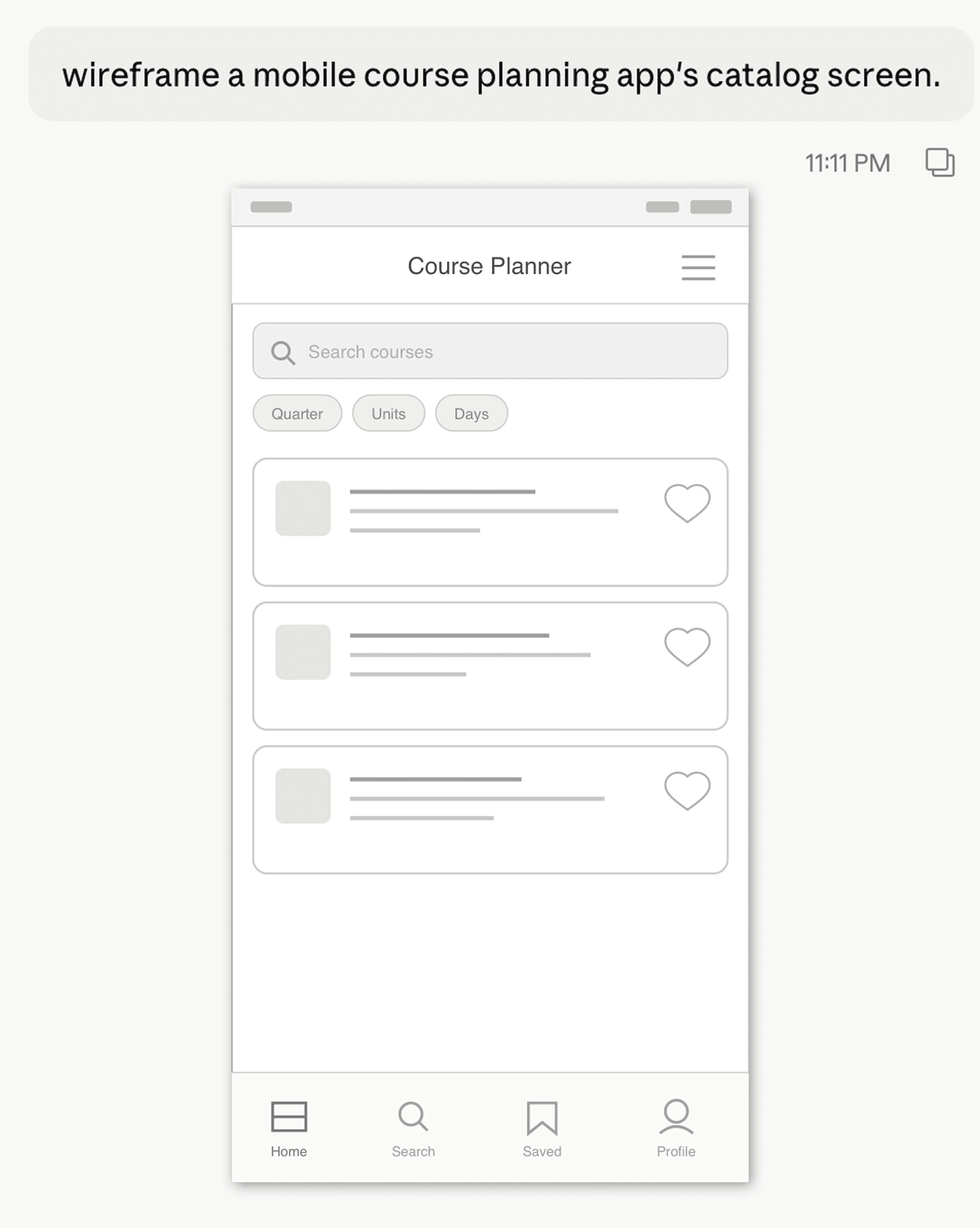
Medium-fidelity prototypes
I kept my own top-row structure as the foundation, but pulled two things from the AI version into mid-fi:
The filter chips sitting directly under the search bar (cleaner than my original dropdown-heavy filter row)
Its card layout's clearer visual separation between course title and metadata
Everything else (the sidebar-toggle icon, the single top nav row, the absence of a bottom tab bar) stayed mine, since consistency with desktop Carta mattered more than following a generic mobile pattern.

FOCUSING ON MAINTAINING CARTA'S visual & functional consistency
MAIN DESIGN ITERATIONS
Structuring individual course screen
I chose the third layout as it creates a clearer visual hierarchy and makes better use of white space.
Separating the course title from the search area reduces visual competition, while moving search into the top navigation creates a more consistent navigation pattern across the app and frees the content area to focus on course information.

Landing on a nav bar that stays out of the way
I tried a few different approaches here. You can see iterations where I'm playing with how the tabs are laid out, how much vertical space they take up, and how you'd move between sections like the four year planner, quarter calendar, and so on.
I was trying to figure out how to keep global navigation accessible at all times without it eating into the screen.

I ran three additional iterations exploring different layout variations
I chose the third one, because I wanted the search bar to be present globally so that the users can access it regardless of which page they are at, and the hamburger menu, where the 4 year planner page, course catalog page, and log in and feedback functions are embedded.
Establishing Consistent Interaction Patterns
Active Navigation State
I explored several active-state treatments before selecting a subtle tinted background with a colored outline. This treatment clearly communicates the selected state while remaining lightweight and consistent with the overall visual language.

Sidebar Update Indicator
I selected the top-right badge because it aligns better with familiar notification conventions, as both are well recognized industry conventions.

Finalized high-fidelity
With the nav bar, course screen, and icon feedback pattern all resolved, I pulled everything into a cohesive high-fidelity set.

FOCUSING ON MAINTAINING CARTA'S visual & functional consistency
DEFINING MAIN INTERACTION FLOW
Three ways to confirm an action succeeded


Where AI's suggestions pointed to generic patterns
I also ran AI tools to see what they'd suggest by default.
This comparison between my own design and AI's was useful less as inspiration and more as a filter, as it confirmed that the subtler, icon-level "notification" pattern was a better fit for Carta specifically.

RESULTS:


What early testing and comparison ruled out
The inline text confirmation was the first to go. In testing, more than one participant read "Planned successfully" in red text as an error rather than a confirmation, since red on Carta already signals "action needed" elsewhere in the product.
That left two real finalists, which is what I formally A/B tested next.
Flow A: the sidebar opening immediately as soon as you add something
Flow B was just a subtle icon state change, keeping the sidebar closed.

tested with five participants
The results were actually pretty split! Three out of five preferred Flow B. they didn't want the sidebar popping open every single time, especially when they're adding a bunch of classes at once.
A couple of participants really liked the immediate feedback of Flow A because it confirmed the action worked. It pushed me to think about what the default should be and how to make it feel intentional either way
Then the decision boiled down to technical feasibility, which I talked to Joseph about and he confirmed that both are easily implementable, so I ended up making the decision to go with flow B. This is because I agree with the three participants in that the icon change is more clean and less surprising.
GENERAL USABILITY TESTING
sidebar opening flows
Beyond the A/B test, I also ran broader usability testing with tasks like: explore the four sections of AA174A, plan it for spring, check for conflicts, and change the lecture time.
Explore the four sections in AA174A
Plan AA174A for Spring Quarter
Check if it conflicts with other classes
-> change lecture time in the overview sectionIf so change its lecture time to another
Check if it conflicts with your current schedule
If so unplan
There was almost an even split between users noticing the icon change and noticing, so I talked to a front-end engineer about adding a small animation with the icon change where the red dot on the top right can expand for a second so that its more eye catching, which would be implemented as well as the third feedback.

FInAL DESIGN DEMO
The whole experience takes the same number of taps on mobile as desktop!
The final flow keeps global navigation — search, calendar, hamburger menu — within one tap at all times, while defaulting to the subtler icon-state feedback that testing showed students preferred when adding multiple classes in a row.
ENGINEERING HAND-OFF
Documented edge cases
Rather than handing off static screens alone, I mapped out the sidebar flow, the plan/unplan flow, and the lecture-time-change flow as full user flow diagrams, including edge cases like what happens if a student tries to unplan a course that conflicts with nothing, or changes a lecture time into a slot that then creates a new conflict.
IF I HAD MORE TIME + TAKEAWAYS
Test the icon-feedback pattern with real usage volume
My A/B test only simulated adding one or two classes at a time. I'd want to see how the pattern holds up when students are planning a full quarter and adding many classes back to back!
Extend the mobile patterns to the rest of Carta
This project focused on navigation and the course screen specifically. I think the natural next step is applying the same mobile-first thinking to the four-year planner and course catalog, which still carry over more of the desktop layout than I'd like.